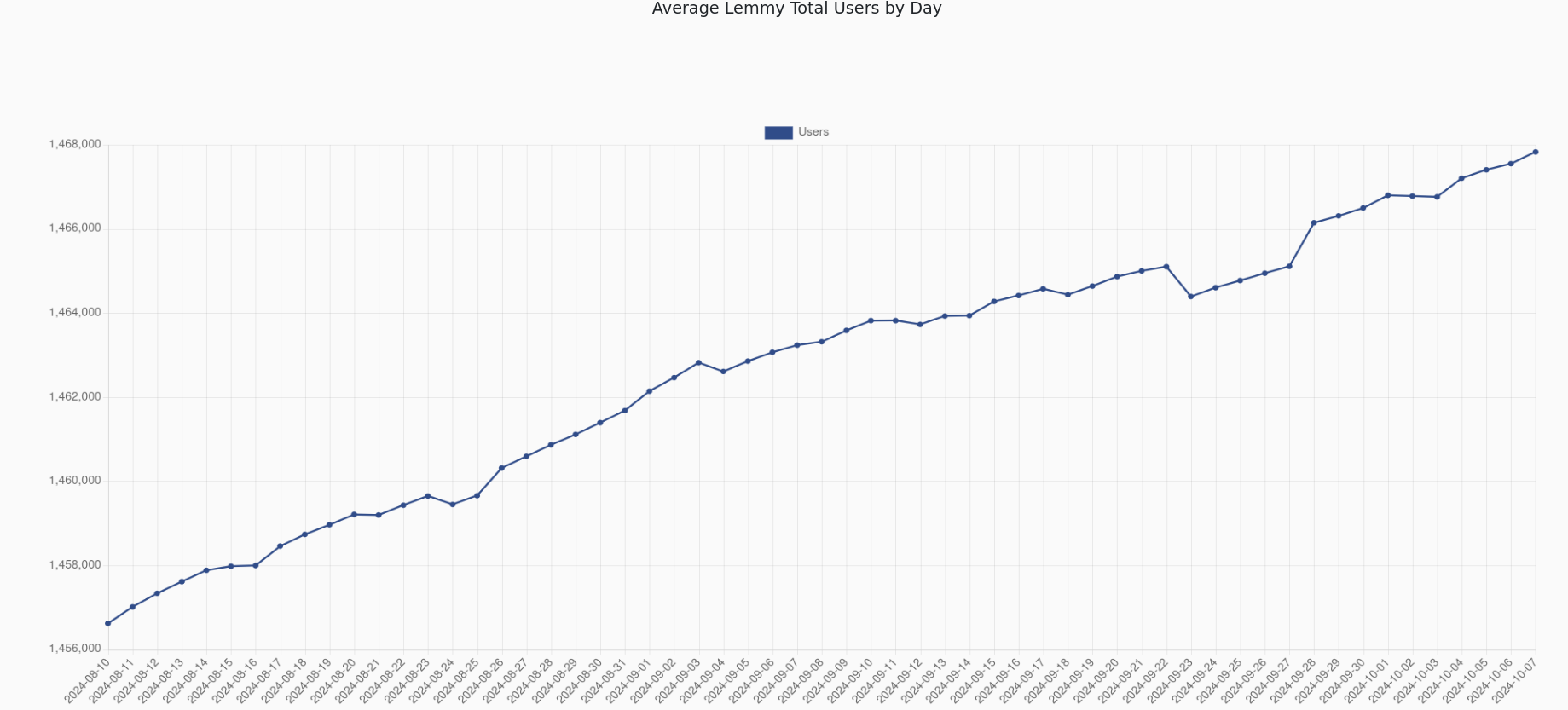
If you start at 0, you see exactly what you’re supposed to: there is a rather negligible trend in the given timeframe.
That’s the point. The number of users has very slightly declined in the past few months. Under the original plot, you have a lot of people (rightly) misinterpreting the data, and saying that a lot of users are leaving the site.
That’s why you start at 0. So that people interpret the data correctly.
You talk as if you don’t understand how plots work. If the change looks like a 90% drop, that’s how it’s going to be perceived.
Moreover, if you do start from 0 you instinctively see the 5% drop, and can make the conclusion that it’s big or small yourself. If you don’t do that, you need to calculate numbers. People don’t do that. They see line go down, and get the impression from that.
Any drop would look the same on the initial plot. 5%, drop 50% drop, 0.005% drop. The ’start your y axis at 0’ rule has a lot of exeptions, but this is not one of them. In fact, it’s the quintessential example of lying with a plot.
If you want to see the actual values for each timestep, there are better tools for that. Such as a table.
Explaining all of this feels bizarre. You are de facto trolling by this weird contrarianism.

Let’s put that to a test
deleted by creator
If you start at 0, you see exactly what you’re supposed to: there is a rather negligible trend in the given timeframe.
That’s the point. The number of users has very slightly declined in the past few months. Under the original plot, you have a lot of people (rightly) misinterpreting the data, and saying that a lot of users are leaving the site.
That’s why you start at 0. So that people interpret the data correctly.
deleted by creator
deleted by creator
deleted by creator
You talk as if you don’t understand how plots work. If the change looks like a 90% drop, that’s how it’s going to be perceived.
Moreover, if you do start from 0 you instinctively see the 5% drop, and can make the conclusion that it’s big or small yourself. If you don’t do that, you need to calculate numbers. People don’t do that. They see line go down, and get the impression from that.
Any drop would look the same on the initial plot. 5%, drop 50% drop, 0.005% drop. The ’start your y axis at 0’ rule has a lot of exeptions, but this is not one of them. In fact, it’s the quintessential example of lying with a plot.
If you want to see the actual values for each timestep, there are better tools for that. Such as a table.
Explaining all of this feels bizarre. You are de facto trolling by this weird contrarianism.