

2·
4 days agoI feel you man lmao
I feel you man lmao
The last I had heard of this were articles months in saying it was still not fixed, but this doesn’t invalidate my point. It may have been retrained to respond otherwise, but it spouts garbled inputs.
Generative AI does not work like this. They’re not like humans at all, it will regurgitate whatever input it receives, like how Google can’t stop Gemini from telling people to put glue in their pizza. If it really worked like that, there wouldn’t be these broad and extensive policies within tech companies about using it with company sensitive data like protection compliances. The day that a health insurance company manager says, “sure, you can feed Chat-GPT medical data” is the day I trust genAI.
That’s basically it. Some Arch users are genuinely just picky about what they want on their system and desire to make their setup as minimal as possible. However, a lot of people who make it their personality just get a superiority complex over having something that’s less accessible to the average user.

There’s not a lot of data to work with, and the kind of test used to determine significance is not the same across the board, but in this case you can do an analysis of variance. Start with a null hypothesis that the happiness level between distros are insignificant, and the alternative hypothesis is that they’re not. Here are the assumptions we have to make:
We can start with the total mean, this is pretty simple:
(6.51 + 6.71 + 6.74 + 6.76 + 6.83 + 6.9 + 6.93 + 7 + 7.11 + 7.12 + 7.26) / 11 = 6.897
Now we need the total sum of squares, the squared differences between each individual value and the overall mean:
Arch:  (6.51 - 6.897)^2 = 0.150
Fedora:  (6.71 - 6.897)^2 = 0.035
Mint:  (6.74 - 6.897)^2 = 0.025
openSUSE:  (6.76 - 6.897)^2 = 0.019
Manjaro:  (6.83 - 6.897)^2 = 0.005
Ubuntu:  (6.9 - 6.897)^2 = 0.00001
Debian:  (6.93 - 6.897)^2 = 0.001
MX Linux:  (7 - 6.897)^2 = 0.011
Gentoo:  (7.11 - 6.897)^2 = 0.045
Pop!_OS:  (7.12 - 6.897)^2 = 0.050
Slackware:  (7.26 - 6.897)^2 = 0.132
This makes a total sum of squares of 0.471. With our sample size of 100, this makes for a sum of squares between groups of 47.1. The degrees of freedom for between groups is one less than the number of groups (df1 = 10).
The sum of squares within groups is where it gets tricky, but using our assumptions, it would be:
number of groups * (sample size - 1) * (standard deviation)^2
Which calculates as:
11 * (100 - 1) * (0.5)^2 = 272.25
The degrees of freedom for this would be the number of groups subtracted from the sum of sample sizes for every group (df2 = 1089)
Now we can calculate the mean squares, which is generally the quotient of the sum of squares and the degrees of freedom:
# MS (between)
47.1 / 10 = 4.71  // Doesn't end up making a difference, but just for clarity
# MS (within)
272.25 / 1089 = 0.25
Now the F-statistic value is determined as the quotient between these:
F = 4.71 / 0.25 = 18.84
To not bog this down even further, we can use an F-distribution table with the following calculated values:
According to the linked table, the F-critical value is between 1.9105 and 1.8307. The calculated F-statistic value is higher than the critical value, which is our indication to reject the null hypothesis and conclude that there is a statistical significance between these values.
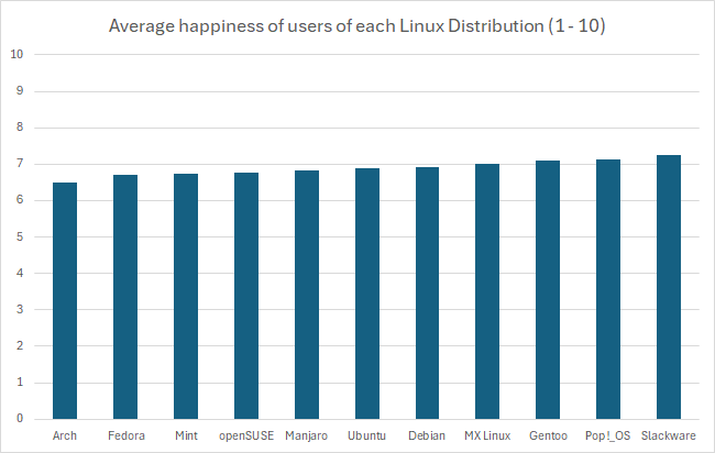
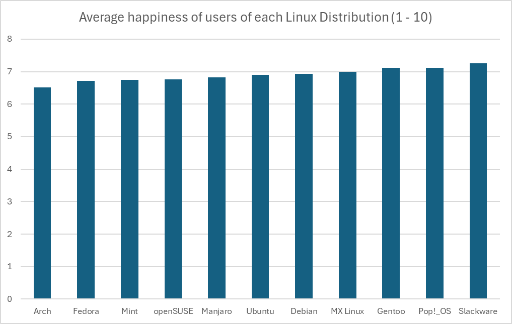
However, again you can see above just how many assumptions we had to make, that the distribution of the data within each group was great in number and normally varied. There’s just not enough data to really be sure of any of what I just did above, so the only thing we have to rely on is the representation of the data we do have. Regardless of the intentions of whoever created this graph, the graph itself is in fact misrepresent the data by excluding the commonality between groups to affect our perception of scale. There’s a clip I made of a great example of this:
There’s a pile of reasons this graph is terrible, awful, no good. However, it’s that scale of the y-axis I want to focus on.
This is an egregious example of this kind of statistical manipulation for the point of demonstration. In another comment I ended up recreating this bar graph with a more proper scale, which has a lower bound of 0 as it should. It’s suggested that these are values out of 10, so that should be the upper bound as well. That results in something that looks like this:
In fact, if you wanted you could go the other way and manipulate data in favor of making something look more insignificant by choosing a ridiculously high upper bound, like this:
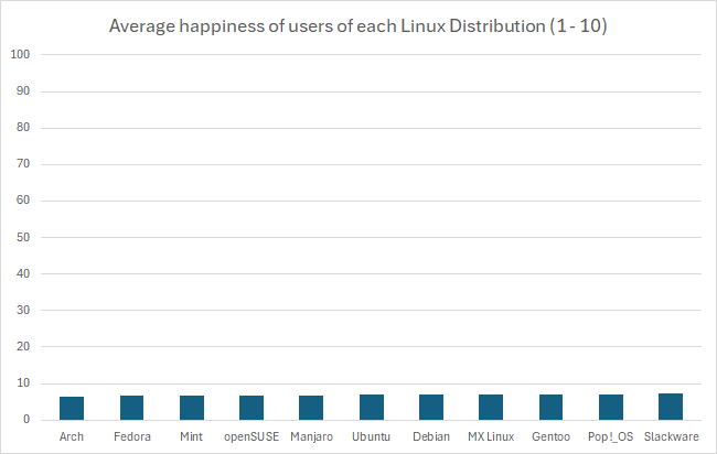
But using the proper scale, it’s still quite difficult to tell. If these numbers were something like average reviews of products, it would be easy in that perspective to imagine these as insignificant, like people are mostly just rating 7/10 across the board. However, it’s the fact that these are Linux users that makes you imagine that the threshold for the differences are much lower, because there just aren’t that many Linux users, and opinions wildly vary between them. This also calls into question how that data was collected, which would require knowing how the question was asked, and how users were polled or tested to eliminate the possibility of confounding variables. At the end of the day I just really could not tell visually if it’s significant or not, but that graph is not a helpful way to represent it. In fact, I think Excel might be to blame for this kind of mistake happening more commonly, when I created the graph it defaulted the lower bound to 6. I hope this was helpful, it took me way too much time to write 😂
Just to kind of demonstrate that idea, I’ve recreated the graph in Excel with the axis starting at 0. I think Excel might actually be to blame for this happening so much, its auto selection actually wanted to pick 6, gross.
Sometimes it’s hard to tell the difference between arch and some gentoo users
Fair enough, it’s just one of those distros you find a lot of those elitists in. Even had a “friend” tell me I wasn’t really a Linux user because I don’t use arch, then gentoo, then openbsd
I know the differences between these metrics are inconsequential because the happiness view doesn’t start at 0, but it still makes me want to shout “what the fuck are gentoo users so happy about” lol
I don’t really know about the uptick, but the general trend upward over a longer period of time I kind of wonder if it’s due to things like the steam deck. I played around with gaming in Linux with wine back in the early 2010s and was woefully unimpressed with how little I could do, especially with the amount of work involved. I didn’t really give it a second look at all, but after the deck released I was blown away by how much has improved, and it’s motivated me to see how much I can get away with without windows. I wonder how many people have had a similar experience.

I pay for a Google workspace account, but I’ve been thinking about self hosting. I’ve had my eye on mailcow for a bit, does anyone recommend?
Ah, got me with a reverse gish gallop. Now I’m an idiot, oh no…
Genuinely, I’ve also been an AMD buyer since I started building 12 years ago. I started out as a fan boy but mellowed out over the years. I know the old FX were garbage but it’s what I started on, and I genuinely enjoy the 4 gens of Intel since ivy bridge, but between the affordability and being able to upgrade without changing the motherboard every generation, I’ve just been using Ryzen all these years.
Giving a CPU more voltage is just what overclocking is. Considering that most of these modern CPUs from both AMD and Intel have already been designed to start clocking until it reaches a high enough temp to start thermally throttling, it’s likely that there was a misstep in setting this threshold and the CPU doesn’t know when to quit until it kills itself. In the process it is undoubtedly gaining more performance than it otherwise would, but probably not by much, considering a lot of the high end CPUs already have really high thresholds, some even at 90 or 100 C.
I genuinely think that was the best Intel generation. Things really started going downhill in my eyes after Skylake.
As I’ve slowly been expanding my homelab, NextCloud caught my attention. I haven’t tried it quite yet, but it might be closer to what you’re looking for.
I’m with you, it’s kind of annoying to see just how much people seethe over a platform. It looks exactly like what redditors did with IG, or TT, or emojis. I understand people’s frustrations with TT, but as someone who’s made content for both TT and YT shorts, engagement for small guys absolutely sucks on shorts and when TT is banned, there’s basically no real alternative. Not only that, but I’m also very concerned about the precedent that’s set by effectively censoring parts of the internet for Americans.
That being said I am also super pumped for Loops, I hope there’s more updates soon because I’ve been keeping an eye on that for a while!
While companies like Nintendo continually kill off game accessibility, Steam doesn’t really take away games from anyone. Digital distribution may not be ownership, but Steam in particular hasn’t given reason to worry.
Yeah, some companies are very slow to adapt. One company I worked for was still using SVN. It was a nightmare lol, and when they did finally migrate to git, some of my coworkers were completely lost.
But there’s also something to be said among developers I’ve worked with on hobbyist projects. Plenty of people who just shared files over and over, or just had it on Google drive or Dropbox
Do you have a source for Search Generative Experience using a separate model? As far as I’m aware, all of Google’s AI services are powered by the Gemini LLM.